PyQt6学习交流群最近组建了PyQt6学习交流群,大家积极交流,现在也100多号人,进群只能邀请,如果需要进群,加下面微信,拉进群。

绘制频谱图,可以通过scipy的spectrogram和matplotlib的specgram实现scipy.signal.spectrogram和matplotlib.pyplot.specgram都是用于生成和绘制信号的频谱图的函数,但它们之间存在一些差异:
库的不同:scipy.signal.spectrogram是SciPy库中的函数,SciPy是一个开源的Python算法库和数学工具包,提供了许多高级的数学算法和便利的函数而matplotlib.pyplot.specgram。
是Matplotlib库中的函数,Matplotlib是一个主要用于绘制图表的库功能的不同:scipy.signal.spectrogram主要用于计算信号的频谱图,返回频率、时间和Spectrogram的值,但不进行绘图。
而matplotlib.pyplot.specgram则既计算频谱图,又进行绘图参数的不同:两者的参数有一些差异例如,scipy.signal.spectrogram的nperseg参数用于指定每个段的长度,而。
matplotlib.pyplot.specgram的NFFT参数用于指定FFT的大小返回值的不同:scipy.signal.spectrogram返回三个值:频率、时间和Spectrogram的值而matplotlib.pyplot.specgram
返回四个值:频率、时间、Spectrogram的值和一个表示图像的对象总的来说,如果你只需要计算频谱图而不需要绘图,或者需要更多的控制和自定义选项,那么scipy.signal.spectrogram可能是更好的选择。
如果你需要快速地计算并绘制频谱图,那么matplotlib.pyplot.specgram可能更适合。1. scipy spectrogram

# 生成一个信号fs = 10e3 # 采样频率N = 1e5 # 信号长度amp = 2 * np.sqrt(2)noise_power = 0.01 * fs / 2time = np.arange(N) /
float(fs)mod = 500*np.cos(2*np.pi*0.25*time)carrier = amp * np.sin(2*np.pi*3e3*time + mod)noise = np.random.normal(scale=np.sqrt(noise_power), size=time.shape)
noise *= np.exp(-time/5)x = carrier + noise# 计算频谱图frequencies, times, Sxx = spectrogram(x, fs=fs)# 绘制频谱图
plt.pcolormesh(times, frequencies, 10 * np.log10(Sxx), shading=gouraud)plt.ylabel(Frequency [Hz])plt.xlabel(
Time [sec])plt.show()在上述代码中,各个参数的含义如下:fs:采样频率,表示每秒采样的次数在这个例子中,我们设置采样频率为10kHz,即每秒采样10000次N:信号长度,表示信号中的样本数量。
在这个例子中,我们设置信号长度为1e5,即信号中有100000个样本amp:信号的振幅在这个例子中,我们设置振幅为2 * sqrt(2)noise_power:噪声功率,表示噪声的强度在这个例子中,我们设置噪声功率为0.01 * fs / 2。
time:时间数组,用于生成信号和噪声在这个例子中,我们使用np.arange(N) / float(fs)生成一个从0到N/fs的等差数列,表示每个样本的采样时间mod:调制信号,用于调制载波信号在这个例子中,我们使用500。
np.cos(2np.pi0.25time)生成一个余弦调制信号carrier:载波信号,表示被调制的信号在这个例子中,我们使用amp * np.sin(2np.pi3e3*time + mod)生成一个正弦载波信号。
noise:噪声信号,用于添加到载波信号中在这个例子中,我们生成一个正态分布的随机噪声,并使用np.exp(-time/5)对其进行衰减x:最终的信号,由载波信号和噪声信号相加得到在计算频谱图的部分:frequencies
:频率数组,表示频谱图中的频率值times:时间数组,表示频谱图中的时间值Sxx:频谱图的值,表示在每个时间点每个频率的功率密度在绘制频谱图的部分:10 * np.log10(Sxx):将频谱图的值转换为分贝单位。
Frequency [Hz]和Time [sec]:y轴和x轴的标签。plt.show():显示图像。2. matplotlib specgram

class MainWindow(QMainWindow): def __init__(self, parent=None): super(MainWindow, self).__init__(parent)
self.setWindowTitle(Spectrogram Analysis) self.setWindowIcon(PyQt6.QtGui.QIcon("./icon/icons8-ok-240.png"
)) # 设置窗口图标# Create a QWidget as central widget self.main_widget = QWidget(self) self.setCentralWidget(self.main_widget)
# Create a QVBoxLayout instance layout = QVBoxLayout(self.main_widget)# Create a QPushButton instance
self.button = QPushButton(Load Data) self.button.clicked.connect(self.load_data)# Create a Figure instance
self.figure = Figure()# Create a FigureCanvas instance self.canvas = FigureCanvas(self.figure)
# Add the QPushButton and FigureCanvas to layout layout.addWidget(self.button) layout.addWidget(self.canvas)
# Initialize data self.data = None def load_data(self):# Open a QFileDialog and load data from the selected file
filename, _ = QFileDialog.getOpenFileName(self, Open File, , Text Files (*.02);;All Files (*)
)if filename: self.data = np.genfromtxt(filename, delimiter=, filling_values=np.nan)print(self.data)
self.update_figure() def update_figure(self):if self.data is not None:# Clear the Figure
self.figure.clear()# Create an Axes instance ax = self.figure.add_subplot(111)
# Plot the spectrogram#Pxx, freqs, bins, im = ax.specgram(self.data[:, 1:], NFFT=256, noverlap=128, Fs=1, mode=magnitude) #
Sxx ,freqs, times, im = ax.specgram(self.data[:, 1:], NFFT=1024, noverlap=256, Fs=1, mode=
magnitude) ##freqs, times, Sxx = spectrogram(self.data[:, 1], fs=1.0, nperseg=2048, noverlap=1024, window=hann)
是的,`mode`参数在`specgram`函数中有多个选项,可以用来控制频谱的计算方式以下是一些可能的选项: - `default`:返回功率谱密度(Power Spectral Density,PSD)。
- `psd`:返回功率谱密度(Power Spectral Density,PSD),这与default模式相同 - `magnitude`:返回每个频率的幅度。
- `angle`:返回每个频率的相位角 - `phase`:返回每个频率的相位(未归一化) - `complex`:返回复数表示的频谱,包含幅度和相位信息。
注意,不同的`mode`选项会返回不同类型的数据,选择哪种模式取决于你的具体需求 `ax.specgram()`函数返回四个参数,它们分别是: 1. `Pxx`:二维数组,表示频谱的值。
数组的行对应于频率(从低到高),列对应于时间(从左到右) 2. `freqs`:一维数组,表示`Pxx`中每行对应的频率 3. `bins`:一维数组,表示`Pxx`中每列对应的时间。
4. `im`:一个`.image.AxesImage`实例,可以用于进一步定制图像的显示 在你的例子中,`NFFT=256`表示每个窗口包含256个数据点,`noverlap=128`表示每两个窗口之间有128个数据点的重叠,`Fs=1`表示采样频率为1Hz,`mode=。
magnitude`表示计算每个频率的幅度# Redraw the FigureCanvas#as.xlim(0,0.01)#freqs, times, Sxx = spectrogram(self.data[:, 1], fs=1.0, nperseg=1024, noverlap=512, window=hann)。
#freqs, times, Sxx = spectrogram(self.data[:, 1], fs=1.0, nperseg=2048, noverlap=1024, window=hann)# Plot the spectrogram
#ax.pcolormesh(times, freqs, 10 * np.log10(Sxx), shading=auto) ax.pcolormesh(times, freqs, 10 * np.log10(Sxx), shading=
gouraud)# Redraw the FigureCanvas ax.set_ylim(0, 0.1) self.canvas.draw()#self.canvas.draw()
if __name__ == __main__: app = QApplication(sys.argv) window = MainWindow() window.show() sys.exit(app.exec())
相关的讨论使用 python 绘制音频的时频图、频谱图和 MFCC 特征图
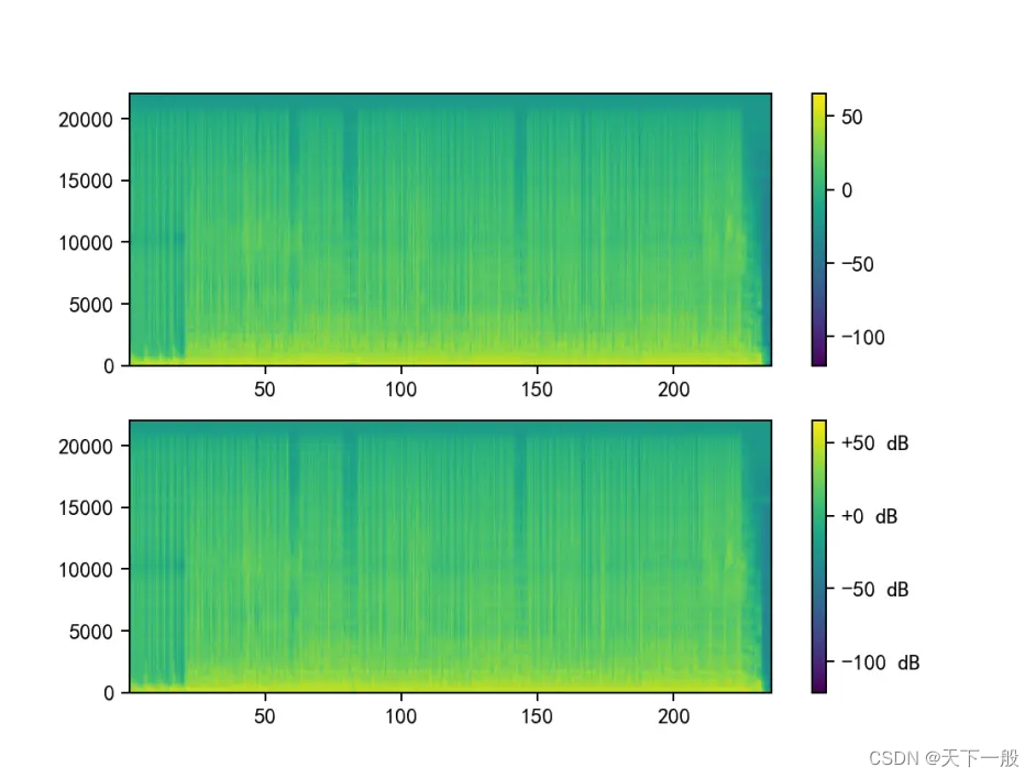
Python 计算时域、频域特征参数python小波分析—海温数据的时频域分解/小波分析/附源码效果如图

另外一个版本成图效果:

代码下载后台回复频谱分析获取所有代码。


发表评论:
◎欢迎参与讨论,请在这里发表您的看法、交流您的观点。